
One of my favorite moments as a designer here at Clockwork is watching clients take ownership of their new website. While we’re always on call for upkeep or strategy, they love being able to add content, create pages, and showcase their latest work without needing our help for every small update.
We design that independence into every site we build for our clients. Since not every business finds the right design team (or decides to hire one in the first place), here are common mistakes to avoid and some practical insight into the design principles we use on a daily basis.
1. Leaving Responsive Design As An Afterthought
The reality is that 62% of website traffic runs through mobile devices, but most people who DIY their website treat responsive design as an afterthought. Either that or they tend to forget it entirely. I’ve seen a lot of gorgeous desktop layouts collapse into a hot mess on a phone.
While building your responsive page layout, try to sketch out the small device view outside of your page builder. It helps to have free control over layout with pencil and paper or a design application like Figma, Sketch, or Illustrator. Even if you’re not an artist, you can learn a lot from just going through this wireframing process.
Better yet, toggle between desktop and mobile views as you build. What looks like a perfect three-column layout on desktop might need to stack vertically on mobile, and that’s totally fine! In fact, it’s expected with responsive design. Tools like the responsive viewing options in the WordPress Editor offer simple toggling tools and most WordPress alternatives follow suit.
For projects like Cobb Galleria Centre, we prioritized responsive design to modernize but also because event guests are always checking venue details, maps, and schedules on their phones while on-site.
The Fix For Responsive Design
- Mobile gets 62% of all traffic – don’t treat it as secondary
- Sketch your layout before building, especially for small screens
- Use tools like Figma or plain paper to wireframe
- Toggle views often and expect stacked layouts on phones
- Use built-in preview tools to check as you go
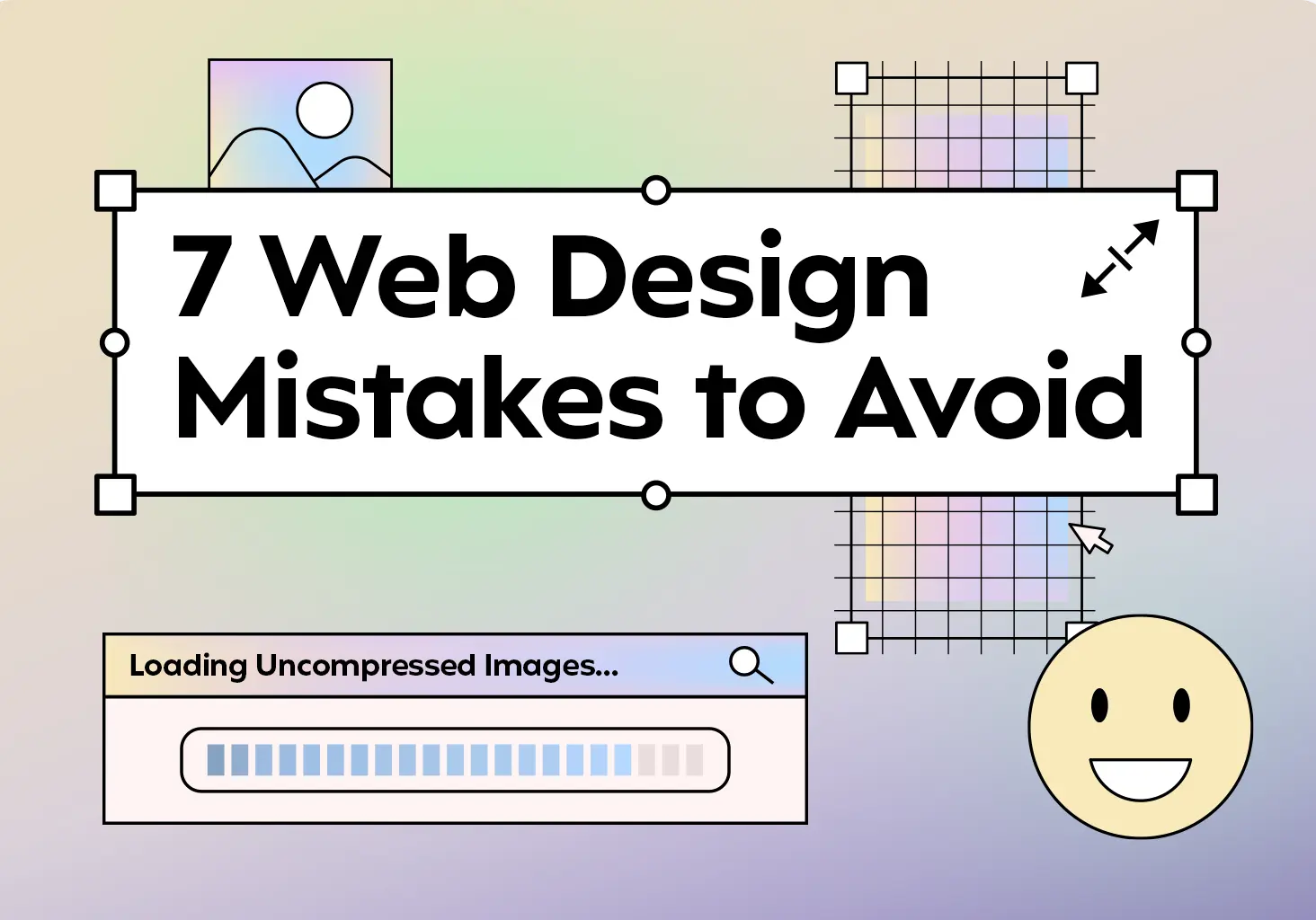
2. Image Sizes That Slow Everything Down
Nothing kills a good first impression like a website that loads in slow, delayed chunks. The culprit? Google warns that massive, unoptimized images are often to blame. You really don’t need a 5000px by 2000px image for a small section on a subpage, especially if it doesn’t improve user experience.
Page Speed Reality Check
The Fix For Bloated Images
- Properly resize images in a photo editor like Photoshop before uploading
- Focus on the subject, crop excess background
- Save as WebP for high compression without quality loss
- Use a plugin like TinyPNG to optimize images directly on your website
3. Forgetting User Flow (The "How Do I Get There?" Problem)
It’s exciting to add new content, but take a step back and revisit your priorities. Say you’ve added a bunch of pages, whether early in the project or later as your site grows. Are you considering how users are going to access these fresh pages? There are a lot of decisions that go into building a well-organized website.
Of course, you could add everything to the main navigation or footer links, but don’t forget about contextual links within relevant page content. A good rule of thumb: users should reach any important page within three clicks. Relying on mega menus or cramming everything onto your homepage creates a poor user experience – like confusing store signage that leaves customers wandering aimlessly.
The Fix For Bad User Flow
- Map out user paths from your homepage to each key page
- Use custom post types for consistent styling and aesthetics
- Check every important page is accessible within 3 clicks
- Add contextual links within relevant content sections
- Test mobile navigation – Prioritize core links first in hamburger menu dropdown
4. Color Choices That Erase Accessibility
Let’s address one of the most common accessibility mistakes: yellow text on white backgrounds. Don’t do it, please! This combination fails basic readability standards and you should avoid it altogether.
FAILS ACCESSIBILITY
PASSES ACCESSIBILITY
When creating a color palette, contrast is more important than aesthetic. Beyond yellow text, you or your designer need to make sure everyone can actually read your content. Whether someone has low vision, color blindness, or is viewing your site in bright sunlight, proper contrast keeps your content readable for all.
Accessibility is becoming more and more of a focus for our entire creative team at Clockwork, and research from WebAIM shows that 86.4% of homepage elements failed contrast guidelines in their analysis of one million websites. If you’re building a website yourself, keeping these accessibility tips in mind will save you from potential legal issues that stem from accidentally excluding users.
The Fix For Inaccessible Color Palettes
- Use tools like WebAIM to check accessibility of text color on background colors
- Shoot for AAA accessibility standards now to avoid headaches later
- With accessibility becoming part of the conversation earlier in project builds, aiming for the highest standard protects you down the road
- Avoid users having to zoom in to read or find their way around
5. Prioritizing Design Over Readability
Snazzy layouts don’t matter if visitors can’t find what they’re looking for. Unless you have very minimal content on pages, make sure you have a readable font, large enough text (optimized for large and small screens!), and clear hierarchy to guide users through the information.
Stick to the basics: Left-aligned body text, consistent margins and padding for each section, and bulleted lists to break up larger paragraphs where it makes sense. As Michael adds in 11 Simple Web Design Tips, keeping your text blocks under 800 pixels wide is another tip for readability. Pay attention to layouts with multiple columns too – editing headings and paragraphs to be similar lengths not only looks great but keeps the reading flow going. Text balance matters.
Your content and web design teams need to work hand in hand. If you’re going solo without a web design team, make sure these elements work with and not against each other. Your content should inform design choices, not the other way around.
The Fix For Hard-To-Read Web Pages
- Left-align your copy
- Consistent, breathable margins + padding
- Text blocks ≤ 800 px for scannability
- Even column lengths for balance
6. Overusing Your Color Palette
If you use every brand color on every section, you’ll overwhelm users. The goal is clarity, not a complete rainbow. Start with your primary color (like Clockwork’s deep purple), add one or two supports, then layer in neutrals and accents as needed.
As you can see on our homepage below, strategic restraint creates way more visual impact than throwing every color at the wall. Our web design process starts with establishing these balanced color hierarchies early to avoid overwhelming users later.

And remember, within the web world, white is a color! On our homepage, we use just a few well-chosen colors and white space to let things breathe. That early restraint makes everything easier to read and navigate.
Your page design doesn’t need to resemble a bland page out of the dictionary, but using colors in a thoughtful, consistent manner will help tremendously. Think of color like seasoning. A little goes a long way, and you can always add more.
The Fix For Overusing Your Color Palette
- Stick to 1 primary + 1–2 support colors
- Use neutrals and accents with purpose
- Embrace white space, it’s part of the palette
- Prioritize contrast and consistency over variety
7. Believing Users Never Scroll Your Website
Users scroll. They expect to scroll. You don’t need to fit everything into the hero section. Yes, “above the fold” still matters on desktop and mobile. But cramming every call-to-action or piece of content into that first viewport usually backfires. Especially on phones with limited space.
With projects like Cobb Galleria Centre (a headline event venue here in Atlanta), we had to walk through the ideal user experience for someone visiting as a guest for the first time as well as an event planner looking for wedding venue information. Both users are equally important, but they don’t need two big buttons right at the top of the homepage.
This also connects back to your content strategy. A clear narrative structure on your homepage helps guide people through a logical journey. Your content and your layout should guide people, not rush them. And try to unify content and calls-to-action in a digestible way. Having Google Analytics reports on how users navigate your website will help you refine the user flow.
Scrolling Reality - Users Expect to Scroll
Rules Are Made to Be Broken (Carefully)
These design principles we’ve covered all work together. Accessible color choices support readability, proper spacing enhances mobile experience, and strategic content placement guides users naturally through your site. When you break these design rules, do it intentionally, but never at the expense of user experience.
The goal isn’t a perfect website (even if we can get you pretty close). It’s creating websites that work for real people using real devices. By following these core fundamentals, you’ll build sites that not only look professional but actually convert visitors.
Need help implementing these web design principles? Our team specializes in creating user-friendly designs that convert like clockwork.