
Poor image optimization is a silent speed killer that lurks behind many slow websites. While you’re focused on design and content and everything else it takes to run your business, those massive images are contributing to higher bounce rates and wreaking havoc on your SEO.
We run into these image issues a lot with new Clockwork clients – either massive uploads on a self-managed site, or a previous agency that took shortcuts. Either way, it’s usually a fairly easy fix so I wanted to share some of our go-to tools and tips in a simple image optimization guide.
Why This Actually Matters (More Than You Think)
A photo straight from your phone can easily hit 4000+ pixels wide and clock in at 5-15MB. That’s massive for the web and not doing your site any favors. When you optimize properly with the tools I’ll share below, you’ll often slash 80-90% off file sizes without any visible quality loss.
Here’s what you should aim for instead:
- Width: Under 2000 pixels for most images
- File size: Under 500KB (ideally much smaller)
- Savings: 80-90% reduction with proper optimization
It’s not just about technical metrics either. When images load instantly, visitors can actually focus on your content instead of waiting around. That smooth experience keeps people engaged and more likely to stick around or take action.
Faster sites also just rank better in search results. That’s why site speed is front and center for everything we do, from our web design services to the in-house SEO audit. The good thing is that getting your images web-ready doesn’t require expensive software or technical expertise.
Step-by-Step: A Practical Image Optimization Guide
The best part about image optimization? Unlike other speed strategies that require Content Delivery Networks (CDNs) or complex caching setups, this is something you can tackle right now. Here’s the exact process we use at Clockwork to optimize images on every client project:
1. Size Your Images Right
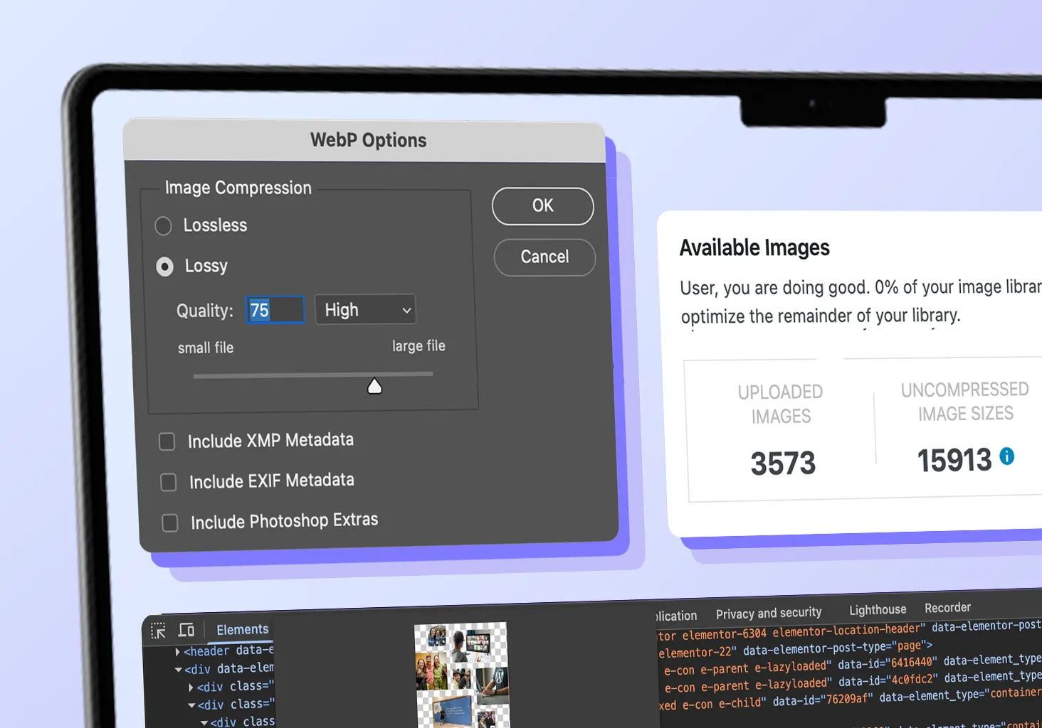
Before we get into compression settings or file formats, let’s start with the basics: don’t upload images that are way bigger than they need to be. It’s surprisingly common to see a 4000px-wide image squeezed down to 600px on the page. That means the browser downloads the full 4000px file but only shows 600px worth, resulting in wasted bandwidth that slows everything down.

1A. How to Find the Display Size of an Image Using Browser Tools
Want to audit your current images? Here’s how to see exactly what’s happening:
- Right-click any image in Chrome and select Inspect
- Hover over the <img> tag in the code panel
- Look for two numbers in the tooltip:
- Rendered size (meaning how it appears on screen)
- Actual image size (what size you uploaded)
If there’s a huge gap between these numbers, you’ve found some easy optimization wins. But before we get to those steps, let’s talk about newer retina images and how they factor into the sizing process.
1B. Should You Use Retina (2x) Images?
High-resolution screens look sharper when you provide images at twice the display size. So if your image shows at 600px wide, uploading it at 1200px will look crisper on modern devices.
You can consider high-density retina images for:
- Hero images and key visuals where sharpness really matters
- Brand logos in headers or important sections
- Product photos that need to look extra crisp
- Any image that’s a major focal point on the page
- Use this selectively though. Don't apply it everywhere or you'll bloat your entire site and slow it down. For secondary images, blog thumbnails, or background graphics, standard resolution usually works just fine.
1C. Avoid Images Larger Than 2000px
Most images don’t need to be more than 2000 pixels in any direction, even those that stretch across the full screen. I max out even full-width images at 2000px because the file size reduction is worth the minor compromise on huge screens. Going bigger just adds load time for minimal visual improvement.
Use only the pixels you need and keep every image as lean as possible. Think of it this way: you wouldn’t send a 10MB email attachment when a 1MB version looks identical to the recipient. The same logic applies to your website images.
Once you’ve got your sizing dialed in, the next step is picking the right file format to make those properly-sized images even more efficient.
2. Choose the Right File Format for Image Optimization
File format choice can make or break your optimization efforts. Just like how we talk about making smart design choices in our guide to avoiding common web design mistakes, picking the right image format is about functionality over aesthetics.
2A. Your Format Options: WebP, JPEG, PNG
Here’s how the three most common web formats stack up:
- WebP: Your best bet for most images. Smaller files, faster loading, great quality. Most browsers support it now, so this should be your go-to choice.
- JPEG: Perfect for photos and images where you see natural color blending and smooth gradients – a blue sky fading to white or shadows on someone’s face, for example. More efficient than PNG but not quite as optimized as WebP.
- PNG: Best when you need transparency or super sharp edges (think logos and icons). File sizes tend to be larger though, so use it sparingly.
When possible, export as WebP. It’s the sweet spot of quality and performance.
One more thing to consider: if you’re working with AI-generated images for your website, the same optimization principles apply. Whether you’re creating images with DALL-E or Midjourney, those files often come out quite large and might need the same compression treatment.
2B. Use Compression Wisely (65–80% is the Sweet Spot)
Both JPEG and WebP let you control compression, which affects file size without changing the actual image dimensions. Most tools have a “quality” slider when you’re exporting.
This is where you’ll see that 80-90% file size reduction I mentioned earlier. The right compression settings can turn a 2MB image into a 200KB file that looks virtually identical.
The magic range is usually 65-80%. Higher compression means smaller files but lower quality. Lower compression gives you bigger files but better quality. For most images, aim for 70-75% to balance sharpness and speed. For less critical images, 65% works just fine.
In terms of compression options, you can apply compression during export in design tools like:
- Photoshop: Use “Export As” or “Save for Web” and adjust the quality slider
- Figma: Choose JPG or WebP and set export quality before downloading
- Canva and Sketch: No design chops needed, both offer export quality settings
Or use dedicated optimization tools:
- TinyPNG (Website or WP Plugin for Bulk Compression)
- WP Smush (WP Plugin for Bulk Compression)
- ImageOptim (Mac App)
These tools give you live previews so you can compare compression levels and choose what works best for your needs.
Comparison: Best Image Optimization Tools
|
Tool
|
Best For
|
Price
|
Compression
|
Bulk Processing
|
|---|---|---|---|---|
|
TinyPNG
|
Quick web optimization
|
Free/Paid
|
Excellent
|
Yes
|
|
Photoshop
|
Professional control
|
Paid
|
Excellent
|
Limited
|
|
Figma
|
Design workflow
|
Free/Paid
|
Good
|
No
|
|
Canva
|
Easy design + export
|
Free/Paid
|
Good
|
No
|
|
Sketch
|
Mac design workflow
|
Paid
|
Good
|
No
|
|
WP Smush
|
WordPress sites
|
Free/Paid
|
Good
|
Yes
|
|
ImageOptim
|
Mac users
|
Free
|
Excellent
|
Yes
|
The Bigger Picture: Performance as Design
Image optimization is just one piece of how we approach web design at Clockwork. Like the strategies I share in our 11 Simple Web Design Tips, it’s all about making smart choices that actually serve your users. Pretty pixels are great but only if they don’t slow down the experience.
Fast-loading images let people actually engage with your content instead of bouncing because they got impatient. It’s one of those behind-the-scenes improvements that makes everything else work better – and makes your whole site feel more trustworthy and professional.
Start with Your Homepage
Want to follow the Clockwork approach? Pick a few images on your homepage and try that Chrome inspection trick I mentioned above. You might be surprised by what you find.
- How big are your images compared to how they actually display?
- Are you uploading massive files straight from your phone or camera?
- Could you get the same visual result with a much smaller file?
Resize the oversized ones, compress everything, and convert to WebP where you can. You’ll probably see immediate improvements in how fast your pages load.
Image optimization might feel like a small technical detail, but it creates ripple effects that do some serious damage. Faster loading improves your search rankings, reduces bounce rates, and makes your website feel more professional to visitors.
Looking for Help with the Big Picture of Your Website Performance?
Our web design services handle all the optimization details, so you get a site that’s both beautiful and blazing fast.