Most people decide whether to stay on a website within seconds of landing on it. That’s barely enough time to read a headline, let alone grasp what your business does or why someone should care. Your homepage is one of the main pages where people make this snap judgement.
The thing is, in those mission-critical moments, website visitors are quickly sizing you up based on three fundamental questions: Do I understand what this business or organization does? Do I feel good about them? And can I trust them?
This is where the “Know, Like, & Trust” framework comes in. Originally a sales concept for building rapport, it’s just as consequential in web design where your homepage is often your one fleeting chance to make a genuine connection with website visitors and potential customers.
What Is "Know, Like, & Trust"?
The beauty of this approach is its simplicity. Instead of guessing what makes visitors stay or leave your homepage, you can evaluate it through three clear lenses.
- ✅ Know means making it immediately clear who you are and what you do, including your core offering. No clever tactics, just clarity.
- 👍 Like is about creating a positive emotional response through tone, visuals, and brand personality. This is where your human side comes through. Visitors should feel a connection that makes them want to learn more.
- 🔒 Trust is all about credibility. That includes client logos, testimonials, social proof, performance, polish, and professionalism. Establishing trust is how you show visitors that you’re legitimate, capable, and worth their time.
These aren’t isolated checkpoints and they don’t exist in a vacuum. As a very quick example, a clear headline (Know) supports approachability (Like), and both build credibility (Trust). When done right, they blend into the kind of cohesive visitor experience you want for a first impression.
Natural Connections, First Impressions (in Seconds)
Your homepage is your digital hub where visitors instantly decide: are we starting off on the right foot here? It’s where social media traffic lands, where Google searches often lead, and where prospects go to size up your business before making contact. If your homepage fails to quickly establish Know, Like, & Trust, visitors bounce – and don’t return.
This is particularly true in today’s competitive landscape. With countless options just a click away, visitors have little patience for websites that don’t immediately communicate value. Our website rebuild prep process always starts with homepage strategy for exactly this reason.
The stakes are especially high because homepage impressions happen so fast. While visitors may take up to 10 seconds to decide whether to stay, they form initial visual impressions almost instantly. Your design, messaging, and overall presentation need to work in unison to create an immediate positive impression that keeps people interested enough to click around.
Building "Know" Into Your Homepage
The “Know” factor is fundamentally about clarity. Your headline and subheading should work together to explain what you do and who you help, without requiring visitors to hunt for basic information.
Start by swapping vague phrases like “Innovative Solutions for Modern Businesses” with something direct: “Custom WordPress Websites That Drive Results for Growing Companies.” For a digital agency, that line tells folks what you offer, how you deliver value, and who it’s for.
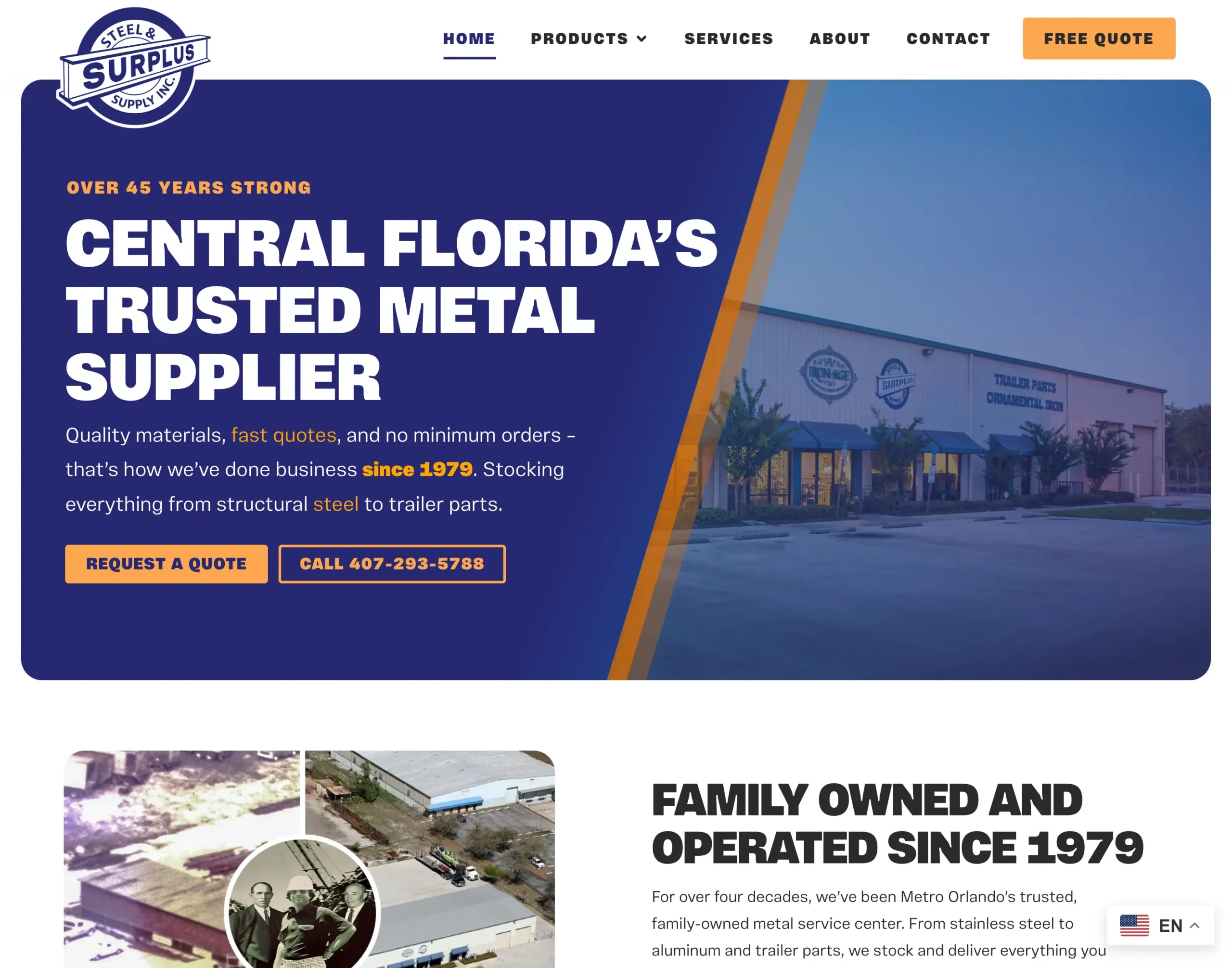
That’s what we did with Surplus Steel. The homepage leads with: “Central Florida’s Trusted Metal Supplier” – a clear positioning statement grounded in geographic relevance, longevity, and friendly service. Supporting details like “Over 45 Years Strong” and aerial photos of their facility help the visitor instantly understand the scope and credibility of their operation.
Your logo should also clearly signal your industry – a steel wholesaler’s logo should feel different from a law firm. Your navigation should do the same, using specific service terms like “Web Design” or “Steel Pipe Bollards” instead of “Solutions.” Clear, descriptive navigation also improves your SEO by giving search engines specific context about your offerings.
Consider including:
- A brief “what we do” section that expands on your headline
- Clear service categories in your main navigation
- Industry-specific terminology that your audience recognizes
- Location information if you serve local markets
The goal is eliminating confusion. When visitors have to guess what you do or whether you serve their needs, they usually don’t stick around much longer to try and find out.
Creating "Like" Through Design and Messaging
The “Like” factor is where personality comes through. This isn’t about being universally appealing to everyone. It’s about resonating with your specific target audience through authentic tone, visuals, and design choices.
Your messaging should speak directly to your ideal clients using language they relate to. If you serve small business owners, acknowledge their challenges and aspirations in terms they’d use themselves. If you work with enterprise clients, demonstrate sophistication and industry expertise in your copy. Meet them where they are and identify with their painpoints.
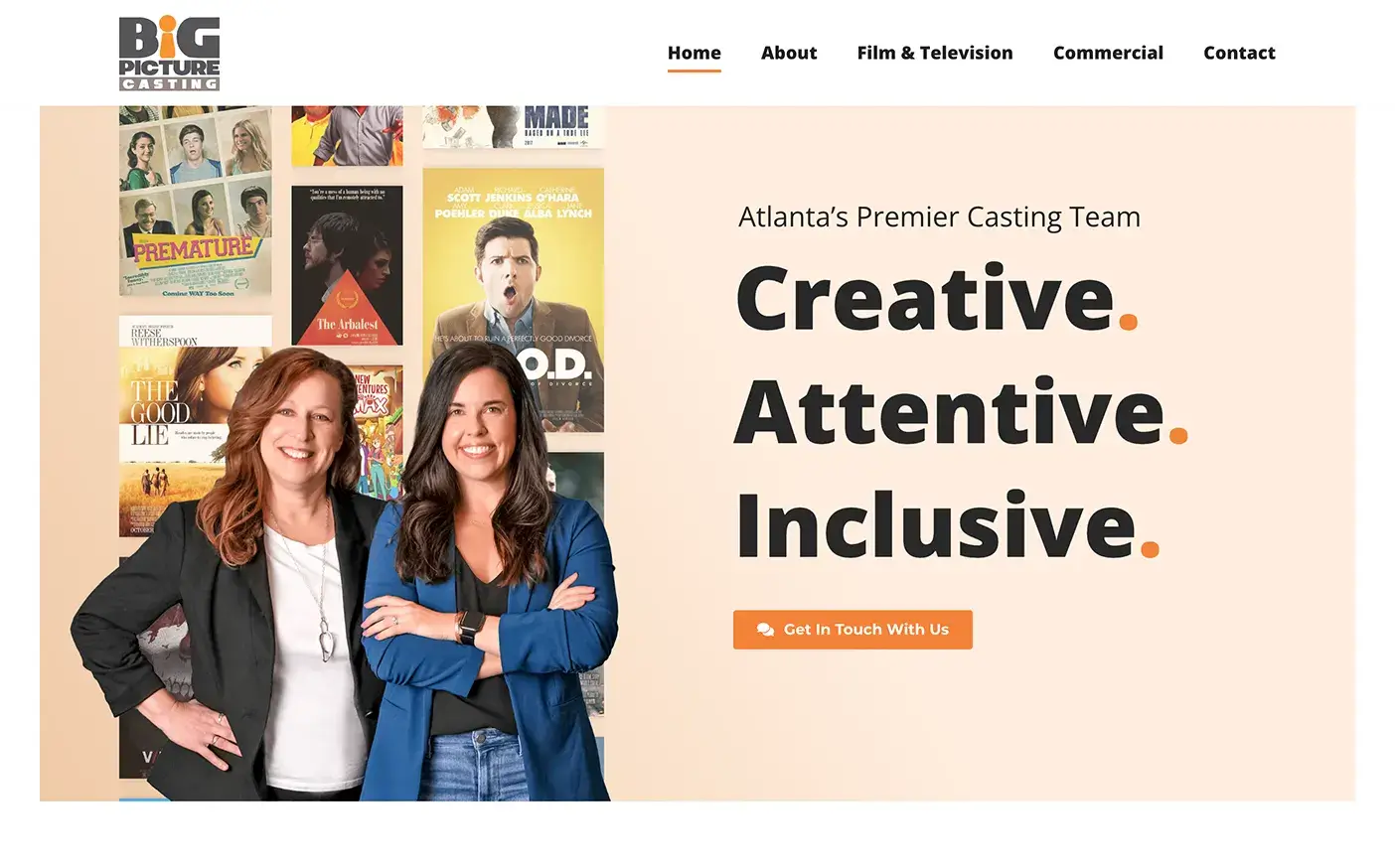
Our goal with Big Picture Casting was for their homepage to open with a photo of the co-founders and the line: “Creative. Attentive. Inclusive.” It feels personal and warm, not like generic agency-speak. That’s intentional. Casting directors and producers aren’t looking for flash – they’re looking for people they trust. The whole site backs up that tone, with team photos, a track record of well-known projects, and a section that reads: “We Show Up.”
Authentic photos of your team, workspace, production process, or actual clients feel more invested than generic stock images. Clean, intuitive design that’s smooth to navigate adds another layer of positive user experience that visitors will associate with your brand.
Effective “Like” elements include:
- A founder note or brief mission statement that humanizes your brand
- Photos that show real people and authentic moments
- Design elements that reflect your company’s personality
- Tone of voice that matches your audience’s communication style
The key is authenticity. Visitors can sense when a brand is trying too hard or putting on an act. As I cover in 11 Web Design Tips That Actually Help, keeping things simple and focused often creates stronger emotional connections than flashy but hollow presentations.
Establishing "Trust" From the First Click
Trust is both a feeling and a function. It shows up in design, performance, and proof.
Social proof, like a review or testimonial, is your most powerful trust-building tool. Client logos, testimonials with names and photos, case study results, and industry awards all signal that other people have successfully worked with you. Even simple statements like “Trusted by 50+ Atlanta businesses” can offer subtle reassurance – whether consciously or subconsciously.
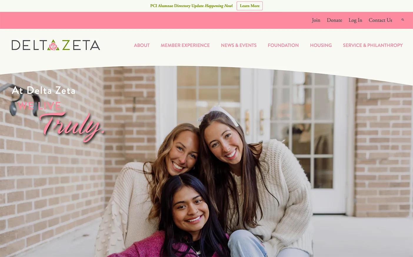
Case in point: Delta Zeta’s award-winning website includes a homepage featuring authentic sorority member photos and immediately establishes their 175-chapter scale. This combination of visual authenticity and measurable achievement creates instant credibility. These are all trust signals: visual authenticity, social proof, and third-party recognition.
- Specific client testimonials with names and photos
- Recognizable company logos or industry certifications
- Clear contact information and physical address
- Professional headshots of team members
- Security badges and privacy policy links
Homepage Breakdowns: Real-World Examples
Despite some outliers, the majority of businesses require their homepages to actively work to clarify their services, establish a connection, and instill confidence. Seeing homepages that don’t work can sometimes help just as much as seeing what does – so here’s a few examples:
FleishmanHillard
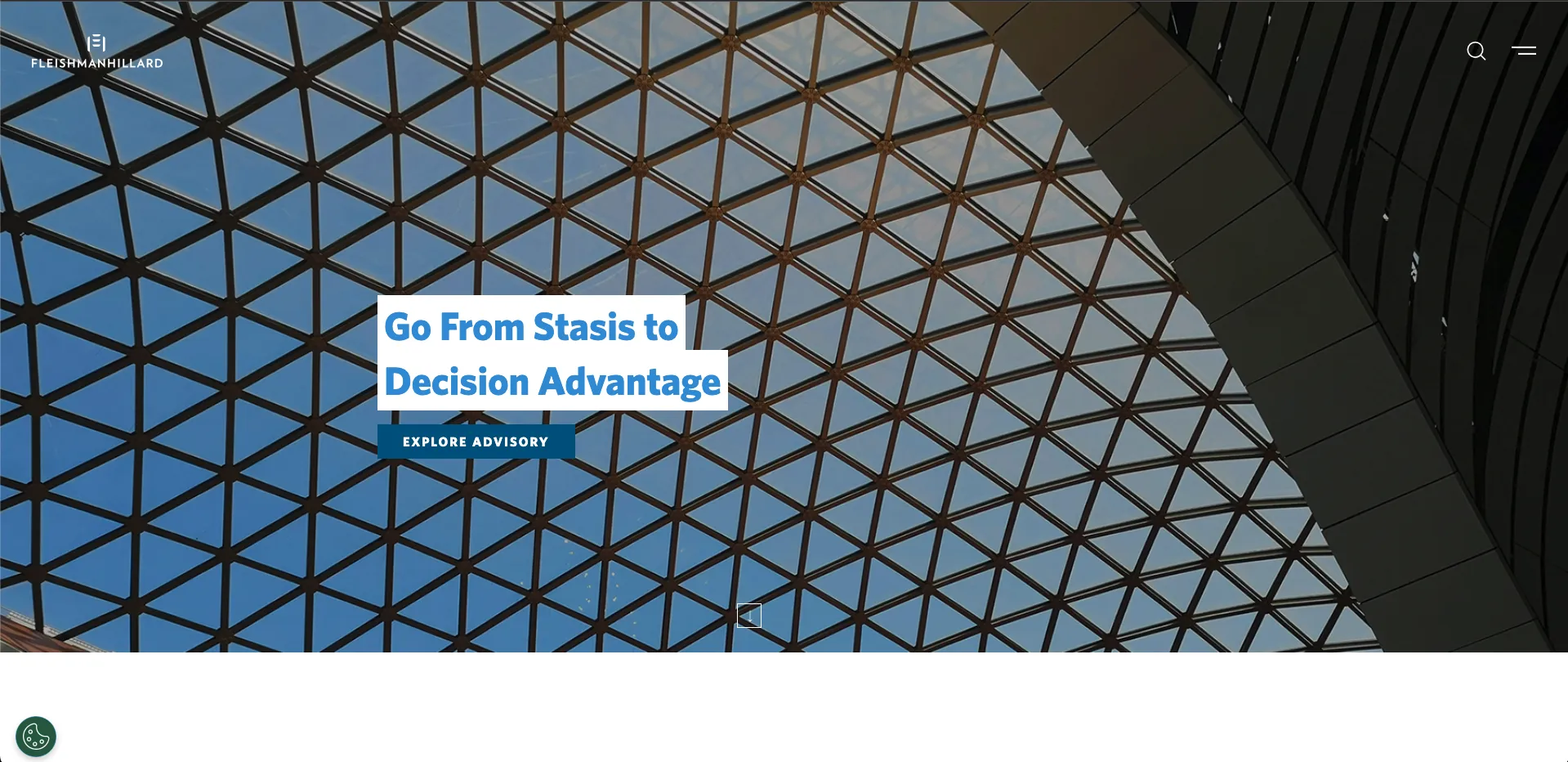
This global PR firm has a polished homepage with stunning architectural photography, but it falls short on the “Know” factor. The headline “Go From Stasis to Decision Advantage” sounds impressive but doesn’t explain what they actually do. A first-time visitor might wonder: Is this a consulting firm? Software company? Management consultancy? The beautiful visuals create good “Like” appeal, and the FleishmanHillard brand carries “Trust” in PR circles, but the vague messaging forces visitors to hunt for basic information about their services.
All Heart PR
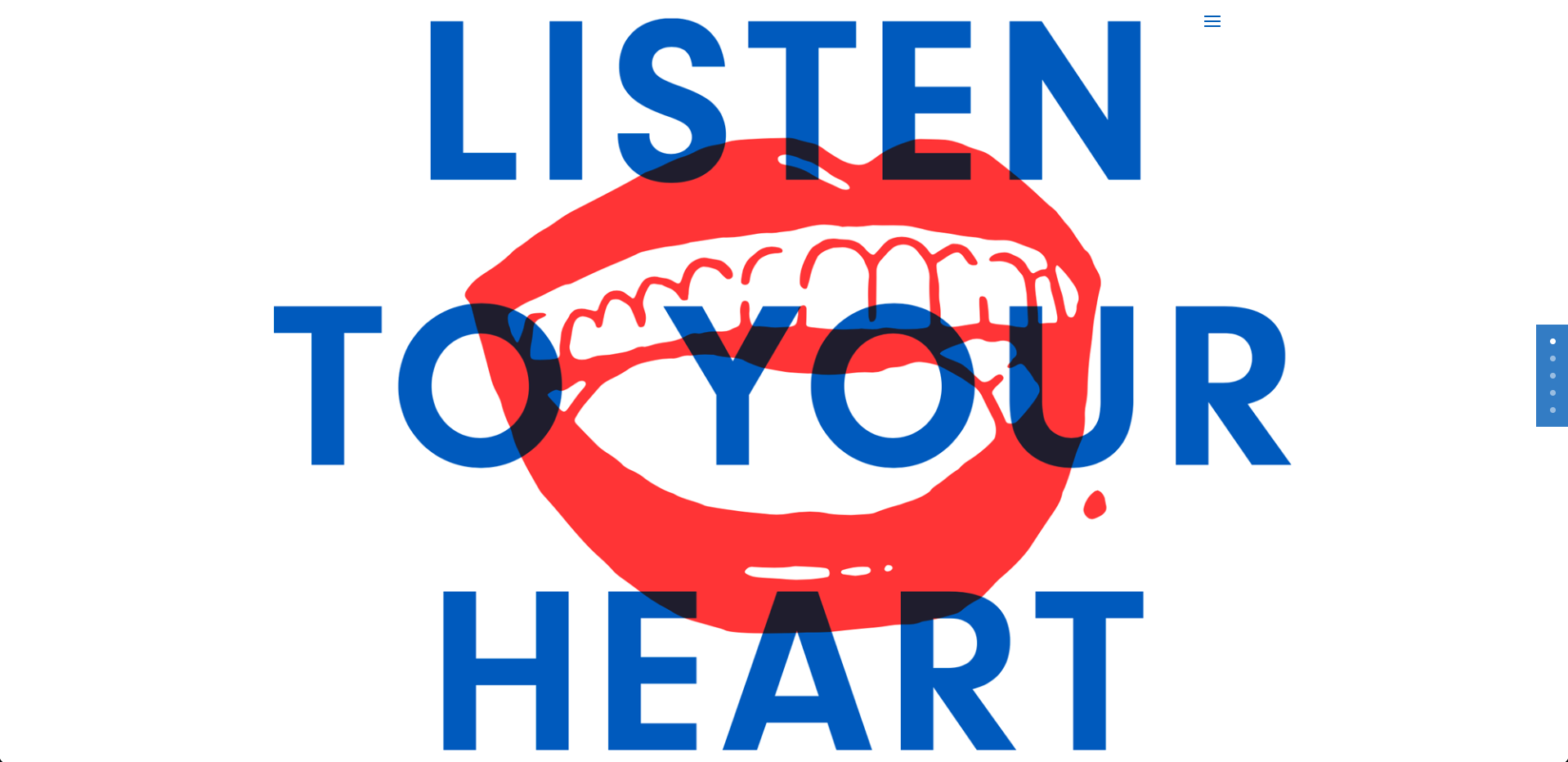
This boutique agency makes the same miscalculation. Their “Listen to Your Heart” messaging with the playful mouth graphic immediately establishes personality and “Like” factor. You can tell they’re creative and approachable. However, beyond knowing it’s PR-related, the homepage doesn’t show what specific services they offer or who they serve. It lands well for “Like” but sacrificing “Know.” For a smaller firm without instant name recognition, this makes it harder to establish credibility with prospects who don’t immediately understand their expertise.
Watch Out for These “Trust-Killers”
The key point is that users won’t go digging for value. If your homepage doesn’t immediately communicate Know, Like, & Trust, most people simply leave. Here are the red flags to avoid:
- Vague headlines that sound impressive but don't explain what you do → FleishmanHillard's "Decision Advantage" could apply to any industry. Be specific about your services.
- Overly creative messaging that sacrifices clarity → All Heart PR's artistic approach is memorable but leaves prospects guessing about their exact expertise.
- Missing clear service categories or target audience → Both examples make visitors work too hard to understand your offerings.
- Cluttered or overly minimal layouts that frustrate users → Any ambiguity leaves visitors wondering what to do next or why they're there.
- Missing contact info or team details → FleishmanHillard and All Heart PR get this right, but many sites don’t make it easy to reach out or learn who's behind the site.
- Broken UX or poor mobile experience → Remember that even minor usability issues make visitors click away and lose trust.
These mistakes are more common than you’d think, especially when teams prioritize creativity over clarity or assume their brand recognition will carry the day. The takeaway here is that even established firms like FleishmanHillard can benefit from clearer messaging, while creative agencies like All Heart PR need to balance personality with practical information.
For more guidance on homepage optimization, check out 7 Web Design Mistakes where we cover additional pitfalls that can hurt your conversions.
Design Around Benefits, Not Buzzwords
Your homepage doesn’t need to win awards but it does need to make people feel like they’re in the right place. The Know, Like, & Trust framework helps you earn trust and build relationships without falling into the traps of being too vague or too creative without enough context.
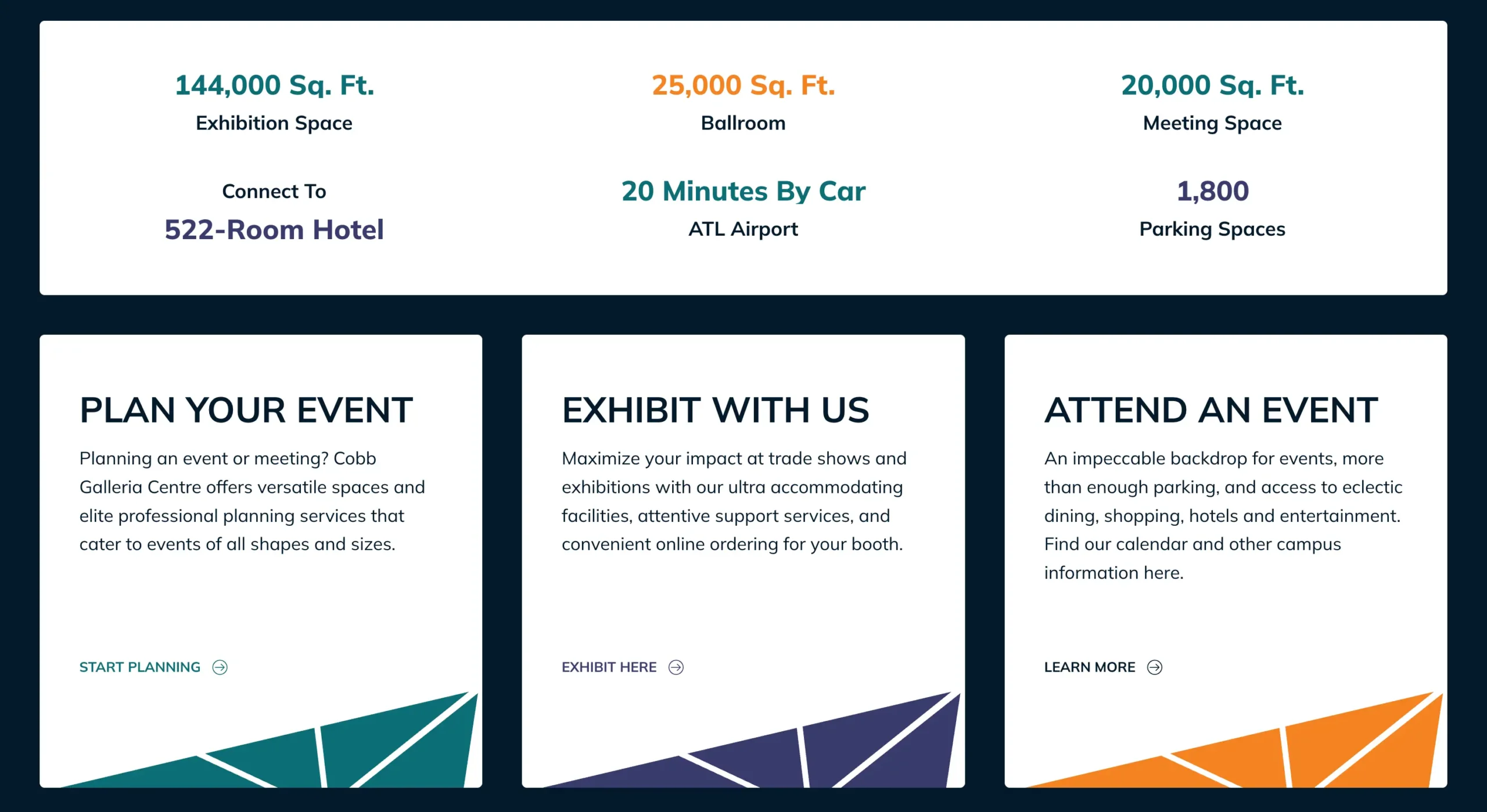
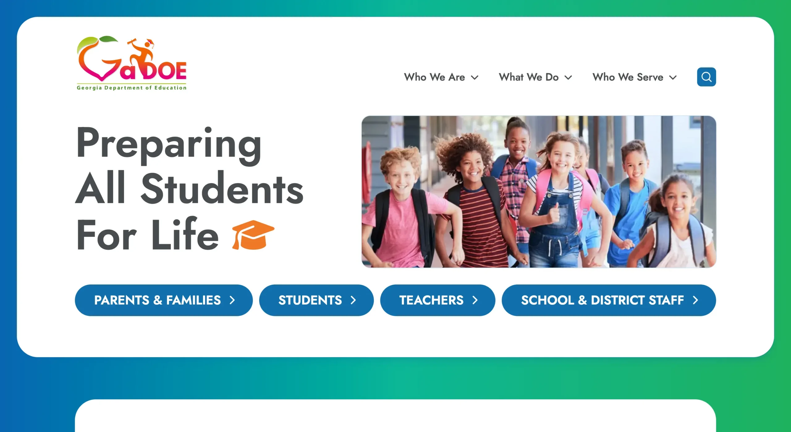
We harness this approach to help clients of all kinds build their perfect homepage. Whether for a steel company, national sorority, Cobb Galleria Centre or Georgia Department of Education, the main goal for any homepage is natural connections and positive first impressions within seconds.
So, before you get started with your next redesign, ask:
- Can someone tell what we do at a glance?
- Do we feel human and relatable?
- Do we prove that we’re credible?
- If not, fix it fast, because the people you want to work with are already deciding whether to trust you in the first few seconds.
Need help optimizing your homepage for Know, Like, & Trust? Let’s talk about your goals and how we can help you connect with visitors from the first click.

