
People with disabilities control $13 trillion in global spending power. That’s no niche market by any standard, but having an inaccessible site pushes away this massive audience of potential customers. The good news? Doing the right thing also happens to be good business.
Whether you’re a designer reviewing visuals, a developer testing functionality, or run a DIY site, this guide offers a practical checklist for building accessible websites that benefit all users.
Disclaimer: This article is a starting point for understanding and implementing good accessibility practices for your website. It is by no means comprehensive and does not guarantee accessibility compliance. If accessibility compliance is a requirement for you, please work with an attorney and a web development team to discuss managing your risk. Our team offers monthly retainers with an accessibility focus for review, development, and reporting to help you reduce your ongoing risk. Reach out and schedule time with us if you’d like to explore some options.
High Level: What is Web Accessibility?
One in four adults in the United States has a disability. That’s about 61 million people. There are also different categories of disabilities, and each takes thoughtful design choices to get right:
- Visual: Blindness, low vision, and color blindness
- Auditory: Deafness and hard-of-hearing
- Motor: Inability to use a mouse, slow response time, limited fine motor control
- Cognitive: Learning disabilities, distractibility, difficulty focusing on large amounts of information
But accessible design isn’t just for these groups. Clear navigation helps users in noisy environments. Keyboard functionality supports people with temporary injuries. High-contrast text aids anyone using their phone in bright sunlight. Accessible design is user-friendly for all.
What WCAG Actually Means for Your Website
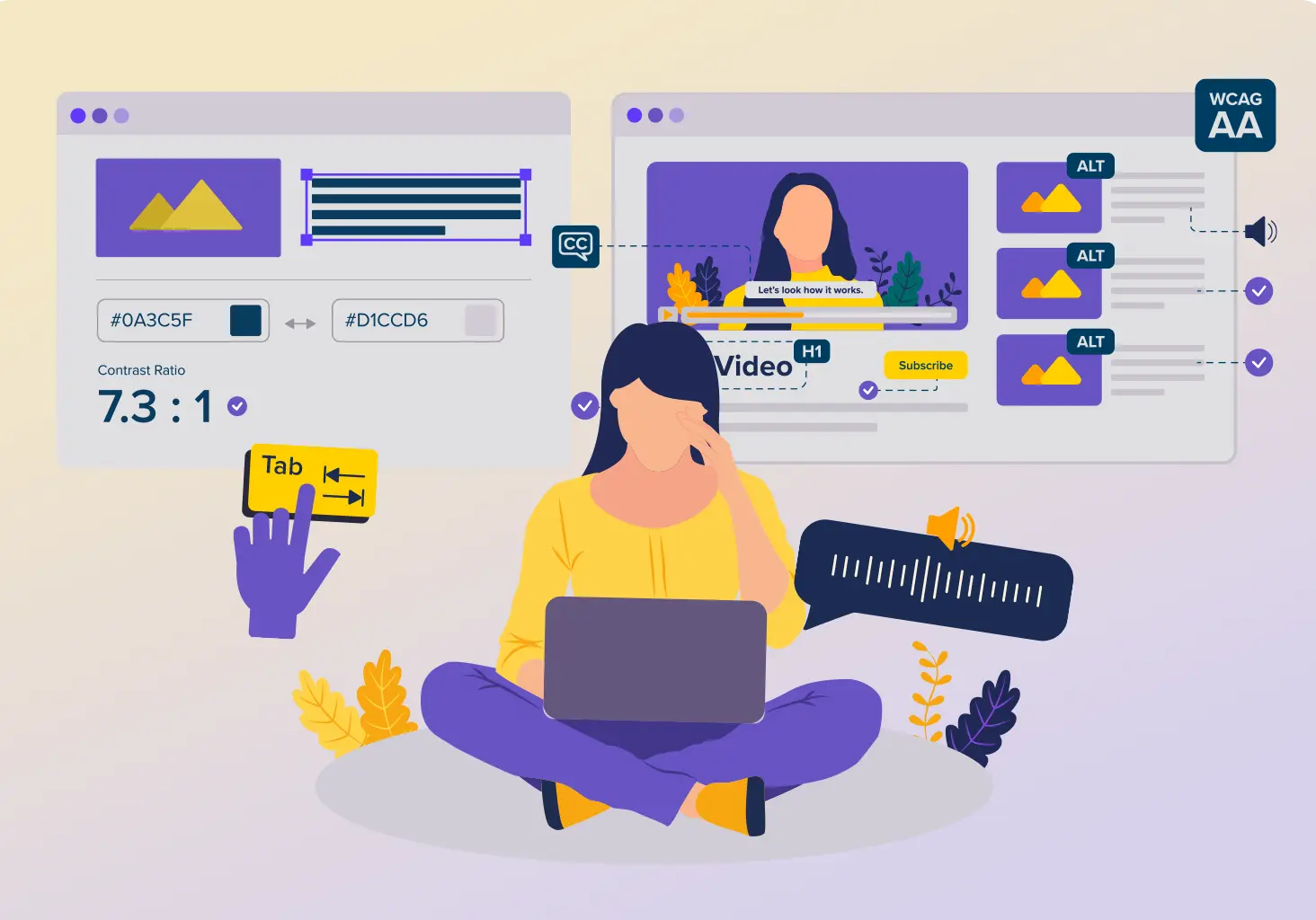
- Perceivable: Users must be able to perceive information through at least one sense – text alternatives for images, captions for videos, and sufficient color contrast.
- Operable: Users must be able to navigate and interact with your interface. Every function needs to work with a keyboard, and users need enough time to complete tasks.
- Understandable: Content and interface operation must be clear – predictable navigation, readable text, and helpful error messages.
- Robust: Content must work reliably across different browsers, devices, and assistive technologies like screen readers.
Design Tip: Color Contrast Requirements
Quick win? Level AA requires a contrast ratio of 4.5:1 for normal text and 3:1 for large text (18pt+ or 14pt+ bold). Use the free WebAIM Contrast Checker when picking your color palette. Test your brand colors early – fixing a problem late (or redesigning an entire site) is expensive.
Why Accessibility Matters for Your Business
Good intentions matter, but the business risks of ignoring accessibility are real – and the stakes are only getting higher.
The cost of inaccessibility:
- Legal exposure: More than 25,000 federal lawsuits filed since 2018, with settlements ranging from $5,000 to over $400,000 (before legal fees and remediation costs).
- Lost revenue: Over 70% of users with accessibility needs will immediately leave a website that they find difficult to use.
- Reputation damage: Excluding users with disabilities leads to public backlash, eroding trust across your entire audience.
But accessibility isn’t just about avoiding problems. I’ll also cover the advantages as we go:
- Accessible sites perform better in search rankings and reach more users
- Proactive compliance reduces regulatory and litigation risks
- Creates better users experiences for all your users
On top of these risks, ignoring accessibility now just means retrofitting accessibility later (at about 10% of your total website budget). Building it in from the start costs around 1-3%.
Who Needs to Think About Accessibility
Let’s talk about who actually needs to pay attention to accessibility guidelines for your website. Honest spoiler: just about everyone who touches your website.
- Designers consider how screen readers interpret layouts, ensure color choices meet contrast requirements, and make sure keyboard users can see where they are on the page. These web design tips can help you avoid some other common pitfalls.
- Developers write semantic HTML with proper heading hierarchy and landmark regions, test with keyboard navigation as you build, and run automated accessibility checks before committing code. These habits prevent accessibility debt from building up.
- Content creators and marketers write clear, concise copy, add descriptive alt text to images, and use video with captions. Accessibility starts with content so no amount of technical fixes can compensate for unclear, poorly structured information.
Want a quick win for right now? Make sure your team is writing link text that makes sense on its own. Users with screen readers can pull up a list of all the links on a page. Descriptive text like “Contact our team” is helpful and clear. “Click here” tells them very little.
The goal is web design services that build accessibility into every project phase from the start. And maintaining it should be part of everyone’s post-launch strategy for long-term compliance.
The Practical Accessibility Checklist
Let’s get into the actual work almost anyone can do. Here’s what you need to focus on during design and development no matter what.
1. Text Alternatives for Images and Graphics
- For informative images: Write clear, concise descriptions that convey the same information as the image. “Bar chart showing 40% increase in sales from Q1 to Q2” works better than “sales chart.”
- For complex graphics: Provide descriptions in the text around the image. Charts, diagrams, and infographics often need more explanation than a brief alt text can provide.
- For logo images: Include your company name and context. “Clockwork Web Dev logo, home” tells users what they’re clicking.
2. Captions, Transcripts, and Audio Descriptions
This one seems straightforward, but it’s often ignored. It goes without saying that video and audio content needs alternatives for users who can’t hear the audio or see the visuals.
For accessible video content:
- Add synchronized captions that accurately represent dialogue, sound effects, and music
- Provide audio descriptions for visual-only information like text appearing on screen, important facial expressions, or scene changes
- Include a full transcript that captures audio and visual elements
The W3C provides specific tips on how to integrate audio descriptions into your videos.
For audio-only content:
- Provide full transcripts for podcasts, webinars, and voice recordings
- Structure transcripts with speaker identification and time markers
These alternatives help more than just users with disabilities. People in libraries, offices, or on public transit rely on captions. Visual learners prefer reading transcripts. Podcasts are far more searchable and SEO-friendly when you publish transcripts.
3. Semantic HTML and Landmark Regions
Captions and transcripts help people access your content. Proper HTML structure helps them navigate it. Semantic HTML elements communicate meaning to assistive technologies, showing users how your content is organized and how to move through it.
- Headings (<h1> through <h6>): Use these hierarchically to create a logical content outline. Stick to a natural cadence – don’t jump from <h2> to <h4>. Screen readers navigate by headings, so your heading structure is like a table of contents.
- Landmark regions: Use these HTML elements to identify different sections of your page:
- <header> for site header/masthead
- <nav> for navigation menus
- <main> for primary page content
- <footer> for site footer
- <article> for self-contained content
- <aside> for supplementary content
Anyone using screen readers can jump directly to landmarks, and skip repetitive content like headers and navigation. Imagine having to listen to your entire navigation menu every time you visit a new page on the same site. Landmarks solve this problem in an anticipated way.
Lists and data tables also need the right markup. Use <ul>, <ol>, and <dl> for lists, and use <table> with headers for tabular data but never for layout. This helps screen readers explain your structure to users.
For more on building with structure in mind, the Semrush semantic HTML guide helps, and our Reframing Page Builders: The Building Block Approach offers other practical tips. If your website is built in WordPress using page builders like Beaver Builder or Elementor, these tools put all of the right landmark and list html tags in just the right place for you. You’ll still need to look out for the right progression of heading tags in your page builder modules, though.
4. Color Contrast and Visual Design
Design directly impacts whether users can perceive your content. Poor color contrast is one of the most common accessibility failures and one of the easiest to fix.
Remember those Level AA requirements:
- Normal text: 4.5:1 contrast ratio minimum
- Large text (18pt+ or 14pt+ bold): 3:1 contrast ratio minimum
- UI components and graphics: 3:1 against adjacent colors
Level AAA (enhanced):
- Normal text: 7:1 contrast ratio
- Large text: 4.5:1 contrast ratio
Another web design tip is to never rely on color alone to convey information. Use text labels, patterns, or icons in addition to color. Don’t use only red and green to show errors and successes. Add text labels or icons so colorblind users understand the meaning.
Font considerations:
- Keep font sizes readable (minimum 16px for body text)
- Avoid font weights below 400 for body text
- Use sufficient line height (1.5x font size minimum)
- Choose fonts that don’t blur at small sizes
Color contrast can get technical fast. The W3C offers a comprehensive breakdown of testing methods and edge cases that’s worth bookmarking.
5. Keyboard Accessibility and Focus Management
Many users navigate websites using only a keyboard due to motor disabilities, preference, or assistive technology. Every interactive element must work via their keyboard.
- Visible focus indicators: When users press Tab to navigate, a visible indicator must show which element is currently in focus. This indicator needs a 3:1 contrast ratio against the background. The default browser focus outline often works fine usually. Focus indicators should appear as a bold outline (usually blue) that moves from element to element as users press Tab. The outline should be thick enough (2-3px minimum) and contrast sufficiently with both the element and background.
- Logical tab order: Users should sift through content in an order that matches the visual layout. Test by pressing Tab repeatedly. Does the focus move in the expected order? Avoid using CSS positioning or positive tabindex values that disrupt natural tab order.
- How to test yourself: Try navigating your own site using only the Tab key (forward), Shift+Tab (backward), Enter (activate links/buttons), and arrow keys (for custom widgets). Can you reach every interactive element? Can you tell where the focus is at all times? This simple test reveals most keyboard accessibility issues.
- Keyboard traps: Users must be able to navigate into and out of all components. Modal dialogs should trap focus while open (users shouldn’t be able to tab behind the modal) but must provide a clear way to close (usually the Escape key).
6. Safe Animations and Motion
Animations can support user interfaces but can also cause serious problems for users with vestibular disorders or cognitive disabilities. Some people experience nausea, dizziness, or even seizures from excessive motion.
Respect user preferences: Check for the prefers-reduced-motion media query in CSS and automatically disable or reduce animations for users who have enabled this setting:
@media (prefers-reduced-motion: reduce) { * {
animation-duration: 0.01ms !important;
transition-duration: 0.01ms !important;
}
} Provide manual controls: Offer pause, stop, or hide controls for any animation lasting longer than 5 seconds. The W3C provides guidance on avoiding content that causes seizures or physical reactions.
Avoid triggers: Never flash content more than 3 times per second. Flashing or strobing effects can trigger seizures in people with photosensitive epilepsy.
Keep motion minimal: Use subtle animations that enhance rather than dominate the page. A gentle fade is preferable to a spinning transition. Smooth, purposeful motion improves UX, while excessive animation creates barriers.
7. Clear Navigation and Descriptive Links
Users need to understand where they are, where they can go, and how to get there. This is particularly important for anyone accessing links with screen readers.
Consistent structure: Keep navigation in the same location across pages. Use consistent labeling – don’t call it “Products” on one page and “Our Solutions” on another. When in doubt, W3C offers guidance on setting up your navigation.
Descriptive link text: It’s worth repeating that Links should make sense out of context. Screen reader users often navigate by pulling up a list of all links on a page. Which is more helpful: “Click here” or “View our accessibility services”?
- Bad: “To learn more, click here”
- Good: “Learn more about WCAG 2.2 compliance”
Adding context for screen readers: Sometimes your link text won’t fully explain what you’re linking to, like a logo that links to your homepage, or an icon button that opens a menu. You can add a label that screen readers (more on this later) will announce but that doesn’t appear visually on the page. This is done using Accessible Rich Internet Applications (ARIA) labels:
<a href="/" aria-label="Clockwork Web Dev home">

  <img src="logo.svg" alt="">

</a>

<button aria-label="Open navigation menu">

  <icon>☰</icon>

</button>
When a screen reader user encounters these elements, they’ll hear “Clockwork Web Dev home” or “Open navigation menu” instead of just silence or generic phrases like “button.”
You can also provide a “Skip to main content” link as your page’s first interactive element. This lets keyboard users bypass repetitive navigation. The link can be visually hidden until focused.
8. Accessible Forms and How to Handle Errors
Forms are conversion interaction points where accessibility often breaks down. When you have unclear labels, confusing errors, and poor validation users are often left with questions rather than answers. The key is making forms logical and easy to access.
Clear labels: Every input needs a <label> element associated with the for attribute matching the input’s id. Try to place labels where users expect them – adjacent to the inputs they actually describe. For example, “Email Address” should sit directly above or beside the email input field.
Required field indicators: Mark required fields clearly using both visual indicators (like asterisks) and text (“required”). Don’t rely on color alone to communicate this.
Error messages: When validation fails, help users fix the problem:
- Clearly identify which fields have errors
- Provide specific, actionable guidance on what needs fixing
- Ensure sufficient contrast (red error text should meet that 4.5:1 ratio)
- Include error summaries at the top of forms for context
- Good error message: “Email address must include @ symbol. Example: [email protected]”
- Bad error message: “Invalid input”
Real-time feedback: Provide inline validation as users complete fields. This reduces errors and builds confidence without requiring them to submit the form first to see what went wrong. The W3C provides further guidance on helping users avoid and correct mistakes.
9. Compatibility with Assistive Technologies
Your site should work reliably with screen readers (JAWS, NVDA, VoiceOver), voice recognition software (Dragon), screen magnifiers, and other assistive technologies.
- Proper ARIA usage: Use those ARIA attributes to improve HTML semantics when native elements don’t suffice. Common uses include:
- aria-label and aria-labelledby for additional context
- aria-expanded for disclosure widgets
- aria-live for dynamic content updates
- role attributes for custom widgets
- Dynamic content: When content updates without page reload, announce changes to screen reader users using aria-live regions or focus management.
- Testing: Regular testing with actual assistive technologies is key if you have compliance requirements around accessibility. Automated tools catch maybe 30% of issues. You need human testing with real assistive tech to find the rest.
Ready for True Accessibility?
Automated tools are just the starting point. Our team tests with screen readers, keyboard navigation, and various assistive devices to catch the issues automated tools miss.
Get in touch to discuss an accessibility audit for your site.
10. Mobile and Responsive Accessibility
With over 60% of web traffic coming from mobile devices, mobile accessibility is no longer optional. WCAG 2.2’s new success criteria specifically address mobile and touch interactions.
- Touch targets: Buttons, links, and form inputs need to be big enough to tap easily on a phone. That means at least 44×44 pixels (roughly the size of your fingertip). Smaller tap targets are hard to hit for anyone with limited dexterity or using their phone one-handed. Here’s W3C’s guidance on touch and mobile accessibility.
- Responsive layouts: Content must adapt gracefully to different screen sizes without horizontal scrolling (except for specific content types like data tables). You want to test everything at various viewport sizes, not just standard breakpoints.
- Orientation: Don’t restrict content to portrait or landscape. Support both unless absolutely necessary for functionality. For example, a piano app might need landscape mode to display all the keys, but your blog posts should work in either orientation.
- Device testing: While browser developer tools help test responsive layouts, nothing replaces testing on actual devices. Screen reader behavior, touch interactions, and performance all vary on real hardware. Test on the phones and tablets your team owns throughout the development process. You don’t want to catch problems late.
11. Plain Language and Cognitive Accessibility
Clear communication benefits everyone, but particularly users with cognitive disabilities, learning differences, or limited language skills.
- Simple vocabulary: Use common words instead of jargon and phrases only a few understand. When technical terms are necessary, define them on first use. The W3C provides guidance on making text readable and understandable.
- Short sentences: Aim for 15-20 words per sentence. Break complex ideas into multiple sentences so people don’t get distracted by run-on ideas.
- Logical structure: Organize content with clear headings, short paragraphs, and bullet points. Use lists to present multiple related items so readers can skim and scan.
- Predictable patterns: Keep navigation, layouts, and interactions consistent across pages. The W3C provides guidance on making content appear and operate in predictable ways. Surprises create confusion.
- Adequate spacing: White space reduces cognitive load. Try not to cram too much into small spaces and work with designers to balance content across your site.
- Reading level: Target 8th-9th grade reading level for general audiences. Government sites aim even lower (6th-7th grade) for maximum accessibility. Tools like the Hemingway App or Microsoft Word’s built-in readability checker can help you test your content.
There’s plenty of writing tips for accessibility but the key is to keep it simple. If you’re preparing content for a website rebuild, the Website Rebuild Prep Checklist walks through how to audit and organize content in a coherent way.
Testing and Maintaining Accessibility
Building accessibility into your site is just the start. Regular testing ensures everything works as intended.
Testing Tools and Methods
Run regular accessibility checks using tools like WAVE, Equalize Digital’s Accessibility Checker, AccessiBe’s AccessScan, or Accessibility Insights for Web. These automated tools scan for common issues quickly, but they catch maybe 30% of problems.
The rest requires first-hand human assessment:
- Navigate your site using only your keyboard
- Test with screen readers
- Read through content critically
- Test on actual mobile devices
Remember, catching issues during development is far cheaper than fixing them after launch.
Ongoing Maintenance
Professional audits are valuable but expensive. Schedule them when you’re launching major redesigns or addressing specific compliance concerns. Between these more formal reviews, you can still build accessibility into your regular workflow:
- Train your team so it becomes part of how you work
- Document your standards
- Assign clear responsibilities for reviewing features
- Respond to user reports promptly
Quick Reference: Accessibility Checklist by Role
For Designers:
- Test color contrast ratios (4.5:1 for normal text, 3:1 for large text)
- Design visible focus indicators for keyboard navigation
- Never rely on color alone to convey information
- Ensure touch targets are at least 44×44 pixels
- Design with sufficient white space and clear visual hierarchy
For Developers:
- Use semantic HTML with proper heading hierarchy
- Implement landmark regions (header, nav, main, footer)
- Ensure all functionality works with keyboard alone
- Add ARIA labels where needed for screen readers
- Test with actual screen readers (NVDA, JAWS, VoiceOver)
- Implement skip links for keyboard users
For Content Creators:
- Write descriptive alt text for all informative images
- Provide captions and transcripts for video/audio content
- Use clear, descriptive link text (avoid "click here")
- Keep sentences short (15-20 words) and use simple vocabulary
- Organize content with clear headings and bullet points
- Target 8th-9th grade reading level
For Everyone:
- Run automated tests with WAVE and Axe DevTools
- Navigate your site using only keyboard
- Review forms for clear labels and helpful error messages
- Check that third-party widgets are accessible
- Document your accessibility standards
For comprehensive guidelines, check out the WebAIM WCAG 2 Checklist.
Resources for Deeper Learning
- Standards: WCAG 2.2 Guidelines, WCAG Overview, What’s New in WCAG 2.2
- Testing tools: WAVE Extension, Axe DevTools, WebAIM Contrast Checker
- Learning: W3C Web Accessibility Initiative, WebAIM Articles, Deque University