
It’s 2026 and you’re annoyingly impressed by your biggest competitors’ website. It showcases sharp branding, loads super fast, and has a feel that makes you take them seriously. Looking at your site, it has a lot of outdated colors, a broken newsletter signup, and images that don’t quite fit.
You know it’s high time for a website refresh, but where do you even start? The more you research, the more overwhelming it gets to know what to prioritize, and what you should leave behind. There’s no magic playbook that works for everyone.
Should you focus on animations, new fonts, or those 3D graphics everyone seems to be using lately? As a designer who works on sites every day, I’ve put together a list of things I build into every page as we take clients from brainstorming and blank wireframes to final site launch.
Start with Web Design Fundamentals
The flashy elements only end up helping if users stick around long enough to see them. Your new site should handle three basic things exceptionally well to make sure that happens:
Strong first impressions based on the Know, Like, Trust framework we use here at Clockwork. A clear headline tells visitors what you do (Know), your design makes them feel good about you (Like), and both build credibility (Trust). All three need to happen “above the fold”, in your homepage’s hero section, where users make snap judgments about your site in a few seconds.
Responsive design means no extra work for your mobile users. That means buttons sized for thumbs, text that’s readable without zooming, and content that stacks logically as screens shrink. Most traffic comes through phones these days, so if your layout falls apart on some screens, you’re sacrificing a good chunk of potential audience.
Fast load times require optimized images, lazy loading for initial smooth experience, and smart choices about what loads first. Nothing kills momentum like waiting for a jumbo-sized image to render. You can compress your images, use placeholder frames for videos (lightweight preview images instead of auto-loading heavy video files), and test your pages on different devices. We’re firm believers that slow sites feel unprofessional no matter how beautiful the design.
These aren’t all the exciting parts of web design, but they’re what determine whether visitors stick around long enough to see the rest. We start here with our web design services because we’ve seen too many beautiful sites fail simply because they skipped over the baseline needs.
Design Tips
Type size, color contrast, and spacing create visual hierarchy that tells users where to look. Try using whitespace to give your design room to breathe, and remember that people expect to scroll. Trusting your users will give them the best experience without causing confusion.
Add Flair Without Losing Function
ADA Website Compliance Is No Longer Optional
Web Trends to Keep in Mind for 2026
We already touched on character-driven typography and the sans-serif backlash. That trend toward more personality reflects what users want in 2026, which is human authenticity over stiff sterility. It’s part of a shift away from the blander minimalism that dominated for so long, and actually goes a long way towards the “Like” part of our Know, Like, Trust framework.
That same desire for originality and distinctiveness is driving 3D integration. When executed well, 3D elements add spatial depth that helps you stand out. If you pull it off, they add another dimension to your pages. But if you force it in without a real reason, they read as gimmicky and untrustworthy.
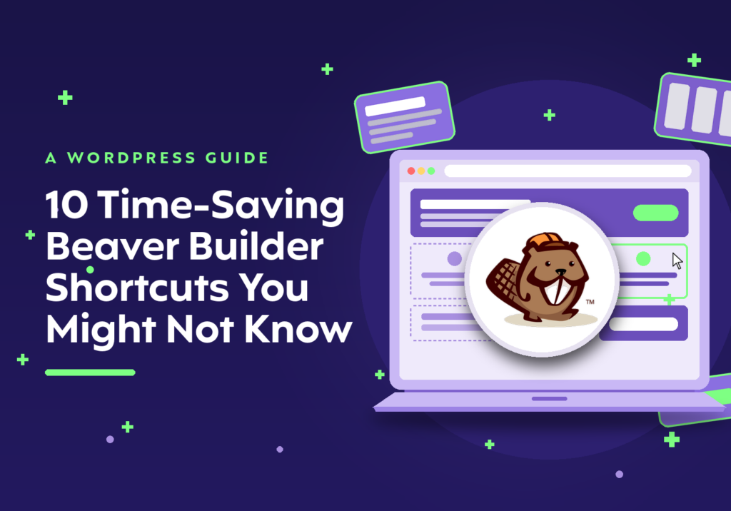
Modal design systems like our building blocks approach are gaining traction because they save time for busy site owners. Beaver Builder and Elementor create reusable elements that keep your site cohesive and professionally consistent as it grows, which turns into a massive time (and cost) saver when you’re managing dozens of pages without a full-time designer.
Ethical design is also being talked about more. This means avoiding deceptive UI patterns like hidden unsubscribe buttons or confusing checkout flows. It means being transparent about privacy and data usage, and communicating honestly every step of the way. Your users expect you to act responsibly, and your design choices show whether you’re meeting those expectations.
Start With What Works, Then Add What Wows
While you’ll want to focus on your foundational set up first, it’s great to outline all of your dream items. The most important thing is that your site is not costing you conversions or clients, so make sure it’s functional, responsive, easy to navigate, and ADA compliant!
Once that foundation is solid, you can start playing around with the big bold ideas. That’s when you can add new fonts, subtle animations, and interactive elements that elevate the entire user experience instead of distracting from it.
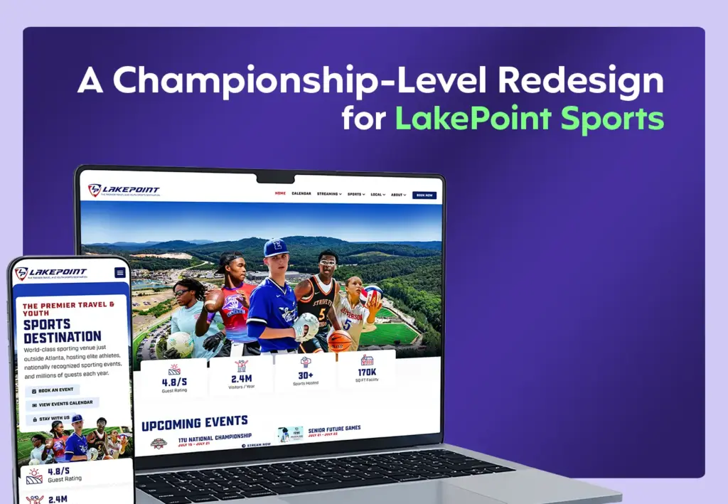
If you’re ready to build a site that stands out for the right reasons, our web design services handle everything from brand strategy through launch.